The Black House


18 more photos
From MDAMMM
"The design idea was to keep the volume but colour everything black"
The owners showed us the single-family home they had just bought, on the outskirts of Sant Cugat, built in 2010, nondescript and with little aesthetic appeal; the vertical faces were exposed brick in ochre tones and all other elements featured different grey tones and finishes.
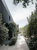
The ground plan revealed a unique V-shaped geometry wrapped around the garden, although it was not well-defined by its enclosures. Despite this, the interior design was correct and fit the client’s needs.
"A 180º design along 4 axes"
The idea we proposed to the owners, right after the first visit, was the possibility of redesigning the existing volume without having to change it, bearing in mind that the finishes and colours of the original materials chosen, were now outdated and obsolete, which were what we would have to adapt and modernise.
Our intervention would draw the attention to the features we found quite interesting to conserve, leaving the rest in the background.
The core areas on which to structure the reform are:
1. Monochromatism
2. Accents on the openings
3. Verticality
4. Capillarity
1. Monochromatism and 2. Accents on the openings
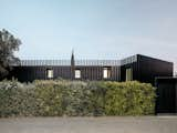
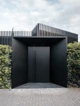
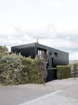
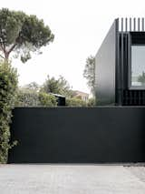
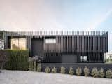
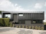
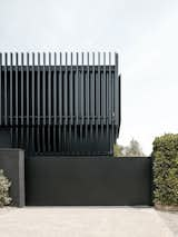
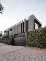
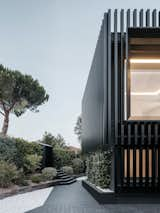
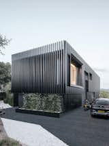
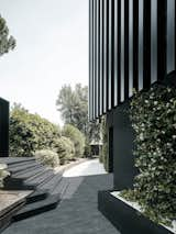
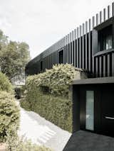
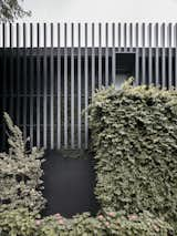
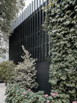
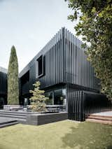
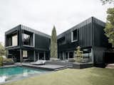
We kept the volume intact in the project, deciding to colour all elements black, thus enhancing the relationship with the surrounding vegetation.
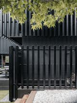
We also accented the openings with large protruding sheet metal angular frames, which project over vertical lathing with hollow sections, as a double skin on the building.
‘The project seems nearly reduced to a graphic sign, monochrome and essential’
Filippo Poli, photographer
3. Verticality
The sections were laid out in different cadences and lengths, emphasising and multiplying the façades with many more vertical planes than the original.
4. Capillarity
The separation of the sections from the façade enriches the entire building, making it lighter and more mutable. In the daytime, the casting of shadows varies by the movement of the sun and, at night, when there is no daylight, it is illuminated by the interior lighting.