

Credits
From Jeanne Schultz Design Studio
Words by Wilson Hack
A prominent Barcelona apartment synthesizes simplicity, continuity and comfort.
The best architecture allows what has come before it to be seen and cared for while at the same time injecting something new, if not idealistic. Spartan at first glance, the interior of this stately apartment building, located on the iconic Passeig de Gràcia in Barcelona, quickly begins to unfold as a calculated series of textures, visual artifacts and perfected aesthetic continuities.
The client, a globe-trotting entrepreneur, selected Jeanne Schultz Design Studio for the remodel and requested that the space be reconditioned into a purposeful and peaceful landing pad. It was to be furnished simply using natural and sustainable materials. Schultz began by gently peeling back before adding only the essentials, resulting in a harmoniously restorative living space where darkness and light coexist and comfort reigns.
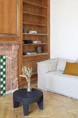
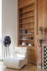
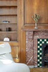
The design was initially guided by the fireplace—from there a subtle injection of matching color extends up into the thick tiered molding and ceiling trim. “The most reckless patterns live here,” remarks Schultz, referring to the checkered green and white tiles, pink-Pollack-y stone and cast iron detailing. The millwork and warm wood wall panels devour the remainder of the living room, eliminating the need for unnecessary artwork.
A curved living room chair by Kave Home punctuates playfully; its shape reveals its pleasant conformity to the human body and sits back, inviting rest and respite. “It’s good for all body types and sizes,” explains Schultz. The single sofa by Dareels is purposefully oversized, casual and inviting. A beige cover was added to soften the otherwise rectilinear edges. Additionally sourced from Dareels, a small yet centrally located side table anchors the space with its dark black wood texture, its visual weight on par with the larger pieces. The black bulbous free standing lamp converses directly with the antique chandelier above. Composed of individual black leather strips, it is seemingly harsh—yet its soft form is reminiscent of a spring tulip.
The continuation of the color palette slips softly into the dining room where velvety green chairs sit delicately on a cascade array of pointed legs. The doors that lead out to the patio were sanded down and treated so that the original shape and form could be retained. Although the same green paint was used throughout, this set of doors speaks in darker tones alongside the acute and penetrating daylight. A few different shades of white paint were used throughout the space to add additional depth and embellish this shadowy texture.
Specialty lights were added into the space to complement the existing overhead lighting. A wall sconce was added in the living room and extra lighting was placed in the kitchen. However, because of the existing barrel vaulted tile ceiling, sconces were placed on the walls rather than above to avoid penetrating the existing architecture.
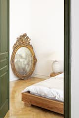
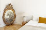
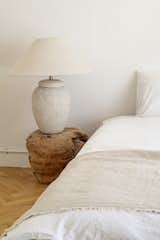
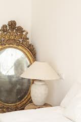
Directly across from the living room, the bedroom delightfully summons the oversized scale of the high ceilings with a low platform style bed—a hardwood frame from Dareels. The bed is purposefully paired with an oversize lamp from Zara Home, composed of a ceramic base paired and a natural linen shade. A gorgeous gilded mirror was inherited along with the apartment and Schultz vowed to incorporate the piece. There was no wall space large enough to incorporate the massive scale, so it remains permanently resting in the corner. The clouded smoky glass acts partially as a full length mirror and partially as a fanciful artifact—a looking glass into the past.
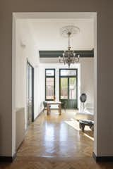
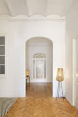
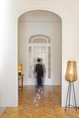
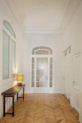
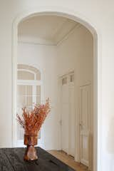
As experienced initially upon entry, the vantage points within are long and linear. As one begins to move through the series of rooms, the rhythm of the spaces expands and contracts adding both privacy and delight to every corner. The views compound into a cascading effect utilizing a discrete repetition of the various framed openings. The view from the entry to the dining room is sliced centrally by the view from the bedroom into the living room, using only color to gesture towards the visual echoes and intersections. Any chance for longitudinal symmetry is dashed by the herringbone pattern in the original wood flooring. Simply balancing all the various wood species, tones and textures was a feat in and of itself, yet the overall gentle unity gives no indication of competing design forces. The handmade console table situated quietly at the entry doesn’t mimic the grain of the wood flooring yet still exudes the same neutral earthy color palette. The base of the lamp that rests on top is also made of wood. “The design is down to earth, quite literally at times,” muses Schultz with a smile.
It would have been easy to overdo it on this project but everything serves its purpose–every last detail is meaningful to the overall cohesion. Nothing more, nothing less. In a world where everything is maximalist, this truly feels like a place to come home to.