Hawthorn House
24 more photos
Credits
From Bradley Van Der Straeten Architects
A garden oasis property in De Beauvoir that celebrates unadorned craftsmanship and the design minds of its inhabitants.
Gareth and Richard, both professors in design and fashion, came to us with a beautiful and distinctive brief to transform their home and to merge the living spaces with their wide De Beauvoir garden. With a fantastic collection of art and books and possessing a serious eye for design, we jumped at the chance to rework this beautiful property and turn it towards its surroundings.
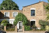
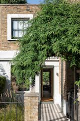
The existing house is a magnificently wide property with a traditional central stair layout and two rooms either side. This layout benefits from a shallow plan from front to back and classically proportioned windows providing daylight and views from every room. Over time, the layout had turned its back on the lush rear garden, with a downstairs toilet in the prime part of the plan, directly in front of the rear garden and a rear extension that blocked the kitchen from the garden.
While there were beautiful proportions at the front of the home, the warren arrangement at the rear was undoing some of the excellent bones of the building. We immediately recognised the same potential as Gareth and Richard, to bring the natural green from the backyard into the home.
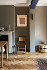
One of the first impressions of this scheme was the exceptional taste of its inhabitants. The existing house was decorated in deep, rich colours with statement art pieces throughout. Gareth and Richard approached Bradley Van Der Straeten at the inception of the project with a well designed brief document that collated their ambitions, taste, favourite colours, artists, designers and pieces of furniture. This served as an inspiration from the outset.
The practical needs of the house were clear, the garden needed to be brought towards the house and vice versa. Gareth and Richard wanted the kitchen to become a hub that faced outwards and connected with the rest of the ground floor and with the exterior. A more functional ground floor entrance, coat area and utility as well as an additional bathroom upstairs, guided the new layout designs.
Aesthetically, Gareth and Richard appreciate honesty in materiality. They didn’t want to cover up the bones of the building and how it was constructed. They had a desire for a distinctive, consistent palette that was all about unadorned craftsmanship.
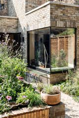
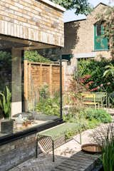
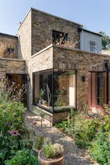
The design solution for the extension was derived from its neighbouring context. A stepped form took shape that responds to the neighbouring buildings and gardens, for a sympathetic extension that only ever steps out as far as its closest neighbour.
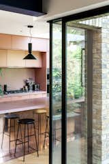
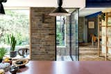
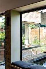
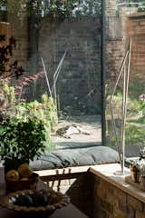
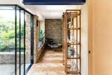
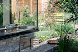
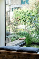
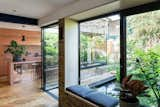
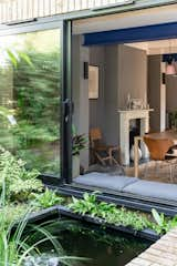
The stepped extension meant that the rooms along the rear of the building could fold around the garden and the garden folds around them. The external walls were punctuated with varying openings, including a piece of corner glazing, which removes a heavy solid corner to open up the space, bring in daylight and provide views to the planting. The edges between the garden and the house are blurred, especially at the window seat, which allows Gareth and Richard to sit in the warmth of their home but feel like they’re sitting in the garden space, no matter the time of year.
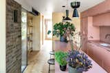
The front of the house stayed largely intact on both floors to make use of the good traditional proportions and layout. The new stair, utility and cloak area on the ground floor were positioned as ‘objects’ within the overall space. This helps the ground floor to flow easily towards the new kitchen and through the front living space and provides views to the garden throughout this floor.
Upstairs, a new bathroom was accommodated behind the existing bedroom, meaning the first floor extension stepped out in a similar manner to the ground floor extension, giving the two floors and the whole rear elevation a dynamic brick layering that overlooks a new wildflower roof and the new garden below.
‘The internal glazed corner is brilliant because It makes the internal space feel much, much bigger.’ Richard
Contrary to convention, Gareth and Richard were keen to have their patio away from the house so that planting and foliage could come right up to the windows. With the patio away from the house, having plants and green at the very edge of the kitchen and living spaces could be the priority. The position of the patio means you have to venture through the whole garden to enjoy the patio but once you’re out there, the whole rear of the house and garden can be enjoyed.
The garden was designed to be intrinsic to the house and vice versa. The architectural design provided a structure to contain Gareth and Richards wild planting, inspired by the Dutch garden designer, Piet Oudolf and his ‘prairie planting’ style.
The planting in the garden is arranged diagonally across the site to respond to the angle of the sun, with ferns and grasses planted in shadier parts and flowers in the pockets of sunshine – exactly where Chunky the dog also likes to stretch out!
The raised pond at the edge of the building holds nine Shubunkin fish that vary in colour and pattern. They stay near the surface of the pond so are often visible and fed from the window seat that extends into the garden. Planting at the edge of the house and around the pond are kept small with lower ferns so as not to block the view, with taller plants set further away which creates a layered view of green from the house.
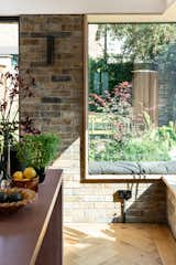
Externally, materials for the project were lead by the context of the De Beauvoir conservation area and internally by Richard and Gareth’s love of honest materiality. Bricks became the pivotal material, not only where you’d expect them for the external walls but also folding in and around the patio and garden beds to frame the planting. The bricks were matched closely to the existing building so the lines between old and new became blurred. The bricks then fold internally and become the finish of the new external walls of the extension, resulting in a consistency in palette that was so important to the brief.
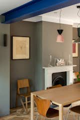
The craftsmanship of the build had to be exemplary with not much opportunity for covering up. This included the bare birch ply stair and the utility ‘objects’ that sit in the main space of the ground floor as well as the highlighted Yves Klein blue exposed steels that show how the building is supported where structural walls were removed.
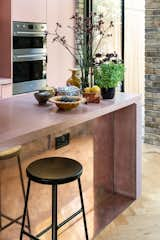
The pink colour for the kitchen came from the initial client briefing document, a favourite of our clients. We knew they wanted this soft warm ‘blush’ somewhere in the project from the get go. It became the distinctive colour for the hub of the house. The kitchen combines three different materials, all matched to one singular palette - the pink concrete, the pink joinery and the reflective copper, creating an enveloping, consistent and bold living space.
‘What I love about the design is the interconnecting surfaces of brick on different planes, including the facades and the patio, it is like a 'brickscape'. London is a city of brick and this is a celebration of it.’ Gareth